


Visualizing Data
- u3037121
- Apr 4, 2017
- 1 min read
"Data comes in all different shapes, sizes, and flavors. There’s no one-size-fits-all solution to collecting, understanding, and visualizing information. Some people spend years studying the topic through statistics, mathematics, design, and computer science. And many people want a bit of extra help getting started". - Chiasson, Gregory et al. (2014)
Sports coverage is the most common place to see visual stimulus for analysis. The channel 9 Cricket commentary team bought in their windows 10 analyser to look at the finer points of the game for the latest summer of cricket action.
The AFL uses Champion Data for most of their statistics in conversations and have taken to using visually pleasing graphs to communicate relatively large amounts of data in simple, easy to understand still pictures:

Our course challenged us to reflect on "how these kinds of approaches might inform our work".
My self reflection on this matter lead me to consider that drawing together all of the factors that have been explored to this point will create a sound base moving forward in my desire to contribute to High Performance Sport.
By reviewing the following, a concise picture of the High Performance Sport sector starts to form:
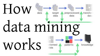
- Pattern Recognition
- Performance Monitoring
- Audiences and Messages
- Ethical Issues
- The Use of 'R'
- The Quantified Self

Comments